A couple of months ago, I was working with a client that was considering a re-brand of their company identity. They were struggling to look like they were a serious contender in a world of much more polished and professional looking competitors. They were struggling to convey the right corporate image and to give the correct first impression to potential customers. After a thorough assessment period wherein I evaluated all of their past and present marketing, their corporate reputation and global identity, I recommended a drastic rebranding because they needed to start fresh! New messaging, New logo, New website, New EVERYTHING! Talk about FUN! Okay, maybe not fun but absolutely necessary.
A lot goes into rebranding and the first step is being able to articulate in your marketing strategy who you are as a company and where you want the business to go. Seems simple enough, eh? This was a major stumbling block for the aforementioned company but within your organization I'm confident you already know this so we'll move on to the second step which is the color theory for the rebranding process.
Color Evokes Emotion:
Large corporations with major brands and major branding budgets have known this for years but it can be incredibly helpful for launching a new brand or even for a small brand looking long term to take into consideration the emotional connection consumers have with color. For example bright colors can offer strong impact while muted tones can offer sophistication and scrutinizing the logos in our daily lives can help in the color selection process for our own businesses. Consider how you react to colors within yourself.
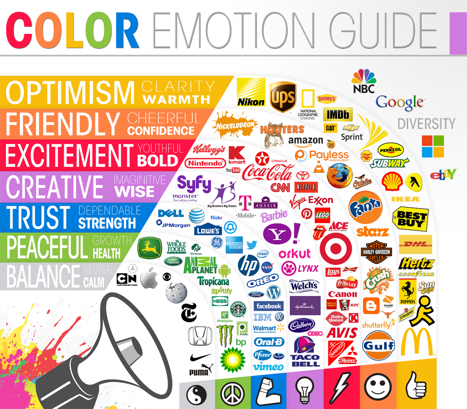
Here is an infographic from Logo Company that I found really helpful in explaining the connection between color to emotion.
You can see above there are many brands we are familiar with and interact with on a daily basis. Lots of our food brands contain red in their logos because it's high impact and make us hungry. Blue, any shade of blue, offers a feeling of quality and dependability, silver, gold or shades of grey are luxurious, orange and yellow make us happy and multiple colors combine for impact and emotional connectivity!
While your company may not be McDonald's or Apple yet, you still should give this thoughtful consideration. Let's start by identifying two or three emotions you would like your brand to evoke. Then rank those in order of importance to the consumer at the time they are making a buying decision. Congratulations, you've just made your preliminary corporate color palette!
If you are an international company color can have implications that are different than your own beliefs. While white might mean purity to USA businesses, it is the color of mourning in several cultures. Red can be exciting and highly impactful but it can also signal danger! Here is another helpful infographic from Information is Beautiful that can be a helping guide to colors among various cultures.


